In this guide, we’ll take an in-depth look at TailwindCSS, a powerful utility-first CSS framework that allows developers to quickly create custom, extensible, and beautiful Ghost themes without writing a line of CSS.
TailwindCSS is a highly customizable CSS framework, making it easy to tailor designs to any project. It offers a wide range of features, such as responsive breakpoints, custom color palettes, and more. Additionally, TailwindCSS provides a ton of resources to help developers get up and running quickly.
Installing Ghost
Installing Ghost locally is quick and easy using the command line. To view the full list of prerequisites for installing Ghost, refer to this article.
Once you’ve met those prerequisites, open up your terminal and run the following command:
npm install ghost-cli@latest -g
This will install the Ghost-CLI command line tool to help you get Ghost installed and configured. Next, cd into an empty directory and run the install command:
ghost install local
This will download and install the latest version of Ghost in your local environment. Once the installation is complete, you’ll be able to access your new site at http://localhost:2368.
Creating a New Theme
Once your local Ghost site is up and running, let’s continue in the command line and install the official Starter Theme by Ghost. This will provide the necessary structure as a starting point for our development.
cd content/themes
git clone https://github.com/TryGhost/Starter.git ghost-starter-with-tailwind
With this command, Git will create a directory named ghost-starter-with-tailwind in your themes directory and clone all contents from the remote repository into that directory.
The Ghost Starter Theme uses npm to manage its dependencies. To install these dependencies, cd into your new theme directory and then run the following command:
cd ghost-starter-with-tailwind
npm install
This will download and install the necessary packages for the theme.
Installing Tailwind
After your theme is created, you’ll be ready to install TailwindCSS and the typography plugin (needed for styling post content output) with the following commands:
npm install -D tailwindcss @tailwindcss/typography concurrently
npx tailwindcss init
The first command installs the packages we need and the last command, npx tailwindcss init will create an initial tailwind.config.js file. This config file is used to add extensions or customize Tailwind by adding new font sizes, colors, etc…
Now that Tailwind is installed, we need need to import the Tailwind CSS files. We can do this by adding the following three @tailwind lines at the very top of the assets/css/index.css file. Feel free to remove the other contents of this file.
@tailwind base;
@tailwind components;
@tailwind utilities;

/*

This is a development CSS file that is compiled to a minified
production stylesheet in assets/built/screen.css using: npm run dev

...
The last step to config Tailwind is to modify the default tailwind.config.js file to ensure its compatibility with handlebar templates used by Ghost themes as well as enable the typography plugin we instead earlier. Open the tailwind.config.js file and replace it’s contents with the following:
/** @type {import('tailwindcss').Config} */
export default {
  content: ["./*.hbs", "./**/*.hbs"],
  theme: {
      extend: {}
  },
  plugins: [
      require('@tailwindcss/typography')
  ]
}
Adding Tailwind to the Build Process
The Ghost Starter Theme uses Rollup for managing build tasks. However, using the rollup-plugin-postcss included in the starter theme is not inherently compatible with Tailwind, but thanks to Ryan Feigenbaum, there’s an easy workaround.
In order to get this working, let’s first remove the following lines from the assets/js/index.js file:
// Import CSS
import "../css/index.css";
We’ll also need to modify the rollup.config.js file and remove the following blocks of code:
// CSS
// Enable the PostCSS preprocessor
import postcss from 'rollup-plugin-postcss';
// Use @import to include other CSS files
import atImport from 'postcss-import';
// Use the latest CSS features in your Rollup bundle
import postcssPresetEnv from 'postcss-preset-env';
postcss({
    extract: true,
    sourceMap: true,
    plugins: [
        atImport(),
        postcssPresetEnv({})
    ],
    minimize: true,
}),
Finally, open the package.json file and update the dev and build tasks:
"dev": "concurrently \"rollup -c --environment BUILD:development -w\" \"npx tailwindcss -i ./assets/css/index.css -o ./assets/built/index.css --watch\" ",
"build": "rollup -c --environment BUILD:production && npx tailwindcss -i ./assets/css/index.css -o ./assets/built/index.css --minify",
Tailwind and Ghost Content
One caveat to using Tailwind and Ghost is the challenge with styling post {{content}}. Since this content is being generated by Ghost and we don’t have direct access to the output to apply Tailwind classes, the Tailwind typography plugin comes in handy. This allows us to apply a set of default Tailwind styles to HTML output that we don’t have control over.
Since we’ve already installed and enabled this plugin in earlier steps, to use it, open up the post.hbs template file and around line 34 add the prose class to the div surrounding the {{content}} output:
<div class="gh-content gh-canvas prose">
  {{content}}
</div>
There are a number of modifiers available for you to customize the style of every outputted tag, so be sure to explore the documentation for the typography plugin for all the available options.
Tailwind and Ghost Cards
One of the highlights of Ghost is it’s extensive selection of editor cards you can use to pull in dynamic content. The Ghost Starter Theme includes default styling for these various cards, however, there may be cases where you’d like to override these styles in favor of your own.
For example, the default Button card features slightly rounded corners that I want to make fully rounded.
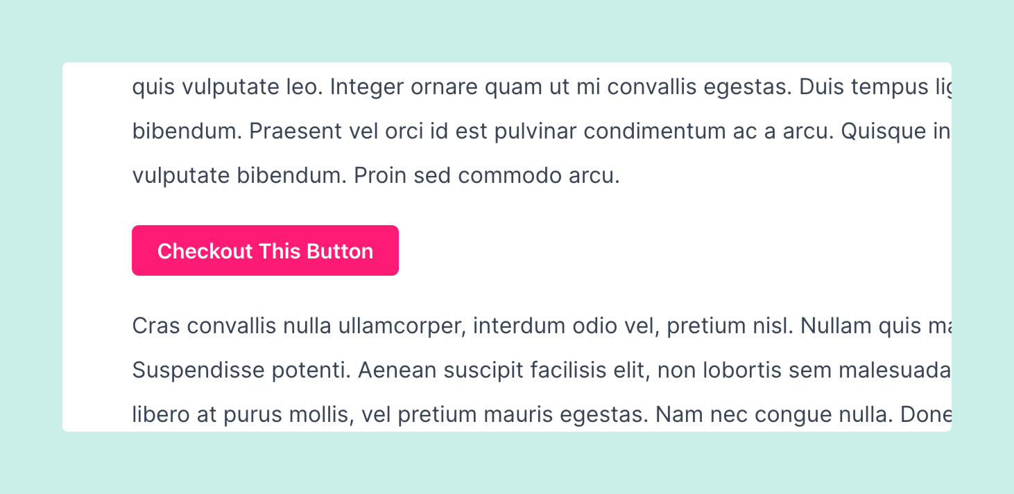
This can easily be done by first identifying the class name of the button card, which you can do by locating it on this page. Here we can see the button card is a container with the class kg-card.kg-button-card with the actual button being a link with the class of kg-btn.
<div class="kg-card kg-button-card kg-align-center">
  <a href="#" class="kg-btn kg-btn-accent">Checkout This Button</a>
</div>
Let’s open up our assets/css/screen.css file and at the bottom of the file add the following block of code:
.kg-card.kg-button-card a.kg-btn {
  @apply rounded-full;
}
By using the @apply function included with Tailwind, we can apply any Tailwind style to any CSS selector.
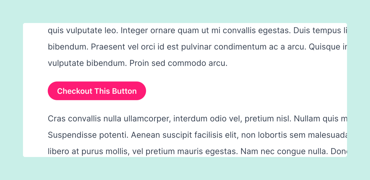
And voila! We have a rounded button that overrides the default Ghost style with Tailwind classes. Now you can free apply this same technique to any other Ghost card.
Are you using TailwindCSS for your Ghost blog? We’d love to know! Tweet us @layeredcraft!

Eric Alli @ericalli
Eric is the founder of LayeredCraft. He has worked as a designer and engineer for 15+ years and loves creating innovative and effective themes for all industries.